










Have you ever walked into a beautifully designed room but felt that something just didn’t look right? In many cases, it’s not the furniture, wall colour, or decor—it’s the lighting.
One of the most common mistakes people make while choosing LED lights is focusing only on the wattage or brightness. However, an equally important factor that often gets overlooked is colour temperature. The right colour temperature can make a room feel warm and relaxing, bright and energetic, or clean and professional. Choosing the wrong one can completely change the mood of a space, even if the lighting is bright enough.
Whether you’re designing a new home, renovating an office, setting up a retail showroom, or planning a commercial project, understanding colour temperature will help you make better lighting decisions.
In this guide, we’ll explain what colour temperature means, the difference between 3000K, 4000K, and 6500K, and which option works best for different rooms. By the end of this article, you’ll have a clear understanding of how to create comfortable, functional, and visually appealing spaces with the right lighting.
What is Colour Temperature?
Despite its name, colour temperature is not related to the actual temperature of the light. Instead, it refers to the colour or shade of light produced by a light source.
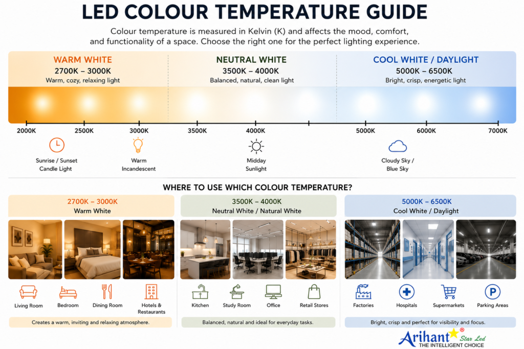
Colour temperature is measured in Kelvin (K). The Kelvin value tells you whether the light will appear warm and cosy, neutral and balanced, or cool and bright.
Think of it like this:
- Lower Kelvin values produce a soft, warm light with a yellowish tone.
- Mid-range Kelvin values create a natural white light that feels balanced and comfortable.
- Higher Kelvin values produce a cool white light with a crisp, bluish appearance.
While all three options can light up a room effectively, each one creates a different atmosphere and is suitable for different applications.
For example, a warm light that feels relaxing in a bedroom may not provide the focus needed in a workspace. Similarly, the bright white lighting used in hospitals or commercial areas may feel too harsh in a living room.
That’s why choosing the correct colour temperature is just as important as selecting the right type of LED light.
Understanding LED Colour Temperature
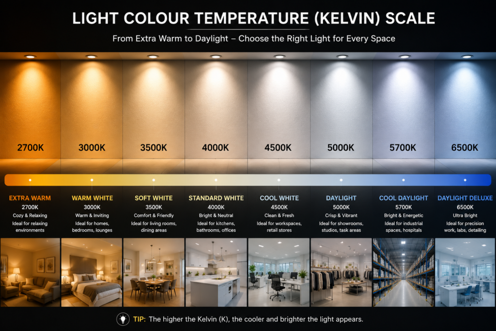
Now that you know what colour temperature means, the next step is understanding how different colour temperature ranges affect the look and feel of a space.
Every colour temperature creates a different atmosphere. While all LED lights provide lighting, the experience of being in the room can change dramatically depending on whether the light appears warm, neutral, or cool.
Instead of asking, “Which colour temperature is the best?” a better question is, “Which colour temperature is best for this particular space?”
Let’s understand each range in simple terms.
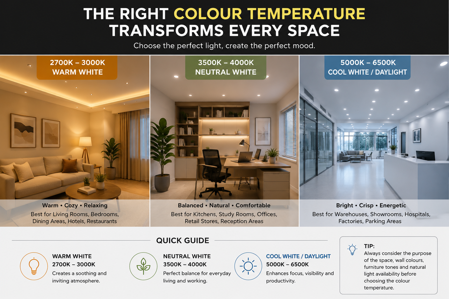
1. 2700K–3000K — Warm White 🟡
Imagine walking into a luxury hotel lobby, a fine dining restaurant, or a cosy living room in the evening. The lighting usually feels soft, warm, and welcoming. That’s the effect of Warm White lighting.
Warm White has a gentle yellowish tone that creates a relaxing and comfortable atmosphere. Rather than making a room appear extremely bright, it focuses on making the space feel inviting and pleasant.
This colour temperature is ideal for places where people want to unwind, spend quality time with family, or enjoy a calm environment.
| Best Suited For – | |
|---|---|
| • Living Rooms | • Bedrooms |
| • Dining Areas | • Hotels |
| • Restaurants & Cafés | • Decorative Lighting |
| • Lounge Areas | • Hospitality Spaces |
Why people choose it
- Creates a cosy and premium ambience.
- Makes wooden furniture and warm interior colours look richer.
- Helps create a relaxing atmosphere after a long day.
- Perfect for spaces designed around comfort rather than productivity.
When it may not be the best choice
Warm White is generally not recommended for workspaces, study rooms, or areas where tasks require high concentration and clear visibility, as it can feel too soft for detailed work.
2. 3500K–4000K: Neutral White / Natural White ⚪
If Warm White feels cosy and Cool White feels crisp, Neutral White sits comfortably in the middle.
This colour temperature closely resembles natural daylight during the day, making it one of the most versatile choices for both residential and commercial interiors. It offers a balanced lighting effect without appearing too yellow or too blue.
Many architects and interior designers prefer this range because it complements a wide variety of materials, wall colours, and interior styles while maintaining a clean, modern appearance.
Neutral White generally goes with every lighting product from COB or Panel Lights to Linear Pendant Lights, in offices, commercial buildings, and modern residential interiors because they provide clean, uniform Lighting.
| Best Suited For – | |
|---|---|
| • Home Offices | • Office Workstations |
| • Retail Stores | • Reception Areas |
| • Clinic Receptions & Waiting Areas | • Modern Residential Interiors |
| • Conference Rooms | • Showrooms |
Why do people choose it
- Offers a balanced and comfortable lighting experience.
- Supports better focus without feeling harsh.
- Enhances the appearance of furniture, flooring, and décor.
- Suitable for spaces used throughout the day.
When it may not be the best choice
When you are planning to install in areas where concentration is required, like a study room.
3. 5000K–6500K: Cool White / Daylight White 🔵
Think about the lighting inside hospitals, warehouses, supermarkets, or large commercial facilities. It often appears bright, crisp, and highly visible. That’s the effect of Cool White or Daylight White lighting.
This colour temperature produces a clean white light with a slight bluish appearance, making spaces feel brighter and more energetic. It’s particularly useful where visibility, precision, and alertness are priorities.
Because of its high brightness perception, it is widely used in commercial and industrial environments where people need to work efficiently or where products need to be clearly visible.
| Best Suited For – | |
|---|---|
| • Warehouses | • Factories |
| • Parking Areas | • Hospitals |
| • Kitchens | • Supermarkets |
| • Utility Rooms | • Industrial Facilities |
Why do people choose it
- Creates a bright and energetic environment.
- Improves visibility for detailed tasks.
- Makes large commercial spaces appear cleaner and more open.
- Ideal for areas where functionality is more important than ambience.
When it may not be the best choice
Using Cool White throughout a home—especially in bedrooms or living rooms—can make the space feel overly bright and less comfortable. In most residential settings, it works best when used selectively in task-oriented areas rather than throughout the entire house.
A Simple Way to Remember
If you’re still unsure which colour temperature to choose, think about how you want the space to feel—not just how bright you want it to be.
- Warm White (2700K–3000K): Best for relaxing and creating a cosy atmosphere.
- Neutral White (3500K–4000K): Best for everyday living, working, and balanced lighting.
- Cool White / Daylight (5000K–6500K): Best for visibility, productivity, and commercial or industrial spaces.
Choosing the right colour temperature isn’t about finding a universally “best” option—it’s about selecting the one that matches the purpose of the room and the experience you want to create.